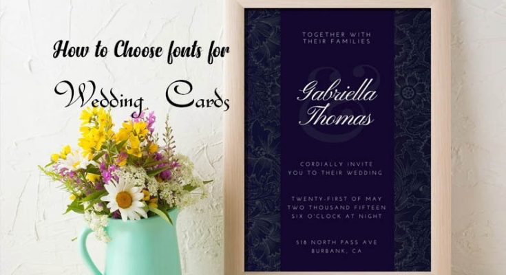
A Complete guide of how to choose suitable fonts for your wedding cards. Your wedding invitation card sets the tone for your special day, giving guests a glimpse of the style and formality of your event. One of the most crucial elements in creating the perfect invitation is the font you choose. The right font can enhance the elegance, theme, and personality of your wedding. But with so many fonts available, how do you select the one that’s best for your invitation?
In this guide, we’ll walk you through essential tips for choosing suitable fonts for your wedding invitation cards, ensuring they align with your theme and style.
1. Consider the Wedding Theme and Style
Your wedding’s theme and style should be your primary guide when selecting fonts. Here’s how different themes can influence your font choice:
- Classic/Traditional Weddings: Opt for formal, serif fonts like Times New Roman, Garamond, or Baskerville. These fonts have an elegant, timeless feel that fits perfectly with a classic wedding.
- Rustic/Vintage Weddings: Fonts with a hand-lettered or calligraphy look work well. Examples include fonts like Alex Brush, Great Vibes, or Honey Script. They add a personal touch that complements rustic or vintage settings.
- Modern/Minimalist Weddings: For a clean and contemporary look, go for sans-serif fonts such as Helvetica, Futura, or Arial. These fonts offer a sleek and straightforward aesthetic that reflects modern tastes.
- Romantic/Fairy-tale Weddings: Cursive or script fonts are ideal. Look for elegant, flowing fonts like Edwardian Script or Tangerine that convey a romantic, whimsical vibe.
- Bohemian or Artistic Weddings: You can be more experimental with fonts like playful, hand-drawn styles or artsy script fonts. Consider fonts like Pacifico or Sacramento for an artistic twist.
2. Mix and Match Fonts Wisely
It’s often a good idea to use more than one font in your wedding invitation, but this should be done thoughtfully. Here are some tips:
- Limit to Two Fonts: Using more than two fonts can make your design look cluttered. One font for headings (such as the bride and groom’s names) and another for the body text works best.
- Pair Fonts that Complement Each Other: When combining fonts, choose ones that contrast but still harmonize. For example, pair a script font with a clean, simple serif or sans-serif font. This creates balance—one font is more decorative, while the other remains easy to read.
3. Prioritize Readability
While aesthetic is important, readability is critical. Your guests should be able to easily read all the important details like the names, date, time, and location.
- Avoid Overly Elaborate Fonts for Main Text: Decorative fonts can be great for headings or short phrases, but they’re not ideal for paragraphs of text. Make sure your font is legible, even at smaller sizes.
- Use Appropriate Font Sizes: Titles (like the names of the bride and groom) should be larger to grab attention. For other details, use a smaller but readable size—typically 10-12pt for the body text and 18-24pt for headings.
4. Match the Font with Your Wedding Colors and Invitation Design
Your font should complement your invitation’s overall design, including its colors, layout, and graphics.
- Light and Dark Balance: If your invitation features a dark background, opt for lighter fonts, and vice versa. This contrast ensures that your text stands out clearly.
- Consider the Printing Method: If you’re using specialty printing techniques like letterpress or foil stamping, ensure that the fonts you choose will reproduce well in those mediums. Some intricate fonts may lose clarity when printed using certain methods.
5. Test Print Before Finalizing
After selecting your fonts, it’s important to see how they look in print. Your computer screen can be misleading, and fonts may appear differently when printed. Print a test version of your invitation to check the legibility, spacing, and overall look of the fonts. Ensure everything looks clear and balanced in the final format.
6. Be Mindful of Trends
Wedding trends come and go, but the most important aspect of your invitation design is that it reflects your style as a couple. While trendy fonts can be fun, choose a font that feels timeless to avoid your invitation looking dated in the future.
7. Incorporate Personalization
Fonts can also help communicate the personal touches of your wedding. If you’re hosting a destination wedding, for example, choose a font that reflects the location’s culture. For a wedding in Tuscany, you might choose a romantic, Mediterranean-inspired script. Personalizing the font adds a unique layer of meaning to your invitation design.
Final Thoughts
Choosing the right font for your wedding invitation card is all about balance. Keep your wedding’s theme, readability, and overall design in mind while selecting fonts that reflect your personal style. By following these tips, you’ll create a stunning invitation that makes a lasting impression on your guests while setting the tone for your special day.
View Also:How to Choose right font for your Projects – A Beginners Guide


