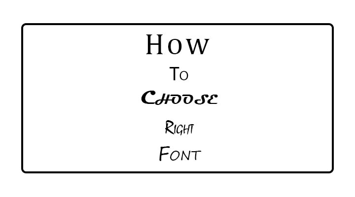
Choosing the right font is crucial for conveying the right tone and ensuring readability in your design. Here’s a comprehensive guide on how to select the right font, especially if you’re dealing with Tamil fonts or a combination of multilingual typography:
1. Understand the Purpose of Your Design
Formal vs. Informal:
- For formal uses like official documents, legal papers, or academic work, opt for traditional serif fonts that have a classic feel.
- For informal uses like social media graphics, blogs, or greeting cards, go for modern sans-serif fonts or playful decorative fonts.
Readability vs. Style:
- If readability is your top priority, especially for long texts like articles or website content, choose clean and simple fonts with good spacing.
- If style is more important, such as for logos or titles, you can choose more decorative fonts, but ensure they’re still legible at various sizes.
2. Consider the Medium
Print vs. Digital:
- Print materials like brochures, books, and posters benefit from fonts that maintain clarity when printed. Serif fonts work well in print due to their additional legibility.
- For digital media like websites or apps, sans-serif fonts are preferred because they tend to be easier to read on screens.
Font Size and Resolution:
- Some fonts may appear clear at larger sizes but can become difficult to read when scaled down. Test your font choice at various sizes to ensure consistency.
3. Pay Attention to Readability
Test in Different Contexts:
- For Tamil fonts, make sure the characters are properly rendered on different devices and browsers, as some fonts may not display certain characters correctly.
- Check the kerning (spacing between letters) and line height to make sure the text looks balanced.
- Choose Fonts with Clear Characters: Look for fonts where each letter is distinct to avoid confusion, especially in complex scripts like Tamil.
4. Match the Font with the Mood of the Design
- Elegant & Sophisticated: If you want a refined look, consider serif fonts or calligraphic Tamil fonts that have a sense of tradition.
- Modern & Clean: For a contemporary feel, use sans-serif fonts that are sleek and minimal.
- Fun & Casual: If the design is playful, like for children’s books or casual social media posts, opt for handwritten or quirky fonts.
5. Pair Fonts Wisely
Use Contrasting Fonts for Titles and Body:
- A good rule is to pair a decorative or bold font for titles with a simple, readable font for body text.
- For example, use a modern sans-serif font for headlines and a clean serif font for paragraphs.
Avoid Clashing Styles:
- Avoid using two fonts that are too similar, as this can look unintentional and confusing. Contrast in weight, size, or style can help create a balanced look.
Examples for Tamil-English Pairing:
- If you’re using a stylish Tamil font for the title, pair it with a simple English sans-serif font for the body text to maintain harmony.
6. Check Font Licensing
- Some fonts are free for personal use but may require a license for commercial projects. Make sure you check the licensing terms before using a font in your design, especially if you plan to monetize your content.
- Consider using fonts from trusted sources like Google Fonts or Adobe Fonts, which provide clear licensing information.
7. Test with Real Content
- Preview Your Content: Type a few sentences or paragraphs in the chosen font to see how it appears in context. This will help you gauge how the font looks with the actual text you’ll be using.
- Adjust Line Spacing and Letter Spacing: Even the perfect font choice may need tweaks. Adjust the leading (line height) and tracking (letter spacing) to improve the flow of the text.
8. Trends and Popularity
- Research current font trends for inspiration, but don’t rely on trends alone. The best font is one that aligns with your brand or project’s identity.
- Look at how successful websites or designers use fonts and adapt those ideas to your needs.
9. Font Style Consistency
- Use the Same Font Family: Using different weights (e.g., bold, regular, italic) from the same font family can create variety while maintaining consistency.
- Avoid Using Too Many Fonts: Limit yourself to two or three different fonts in a design to keep it looking cohesive.
10. Accessibility Considerations
- High Contrast: Ensure the font color contrasts well with the background to improve readability for users with visual impairments.
- Simple Fonts for Dyslexia-Friendly Content: Sans-serif fonts with more open letterforms are generally easier for dyslexic readers to interpret.
Popular Tools to Explore Fonts
- Google Fonts: A great place to find free fonts for digital use.
- Font Pair: Helps in selecting complementary fonts.
- WhatFont Tool: A browser extension that lets you identify fonts used on websites you like.
Example Choices for TamilFont.com
- For Headings: A bold and stylish Tamil font like Bamini or Kavivanar paired with a simple English font like Roboto.
- For Body Text: Use a clean and legible Tamil font like Latha or Noto Sans Tamil to ensure clarity in longer texts.
By following these guidelines, you can choose the right font that not only looks good but also serves the purpose of your design. If you need help with specific font combinations or recommendations, let me know!


